In today’s digital age, good website design is more than just aesthetics. Effective web design captures your audience’s attention and leads them towards taking desired actions, whether it’s making a purchase, signing up, or contacting you. Each element of your website, from layout to typography, plays a role in creating a seamless experience that increases engagement and boosts conversions. Let’s explore 11 good web design principles that are guaranteed to turn your website into a powerful conversion machine.
- What Are the Basics of Good Web Design?
- 1. Follow Hick’s Law
- 2. Leverage the Rule of Thirds
- 3. Optimise Your Website for Speed
- 4. Use Negative Space to Your Advantage
- 5. Consider the F-Layout in Your Web Design
- 6. Use Colours Meaningfully
- 7. Remember to K.I.S.S. (Keep It Simple, Stupid)
- 8. Apply the 8-Second Rule
- 9. Remember the Gestalt Similarity Principle
- 10. Use Faces to Build Familiarity
- 11. Use High-Quality Images
- Follow these Good Web Design Principles and Turn Your Website Into a Conversion Powerhouse
What Are the Basics of Good Web Design?
For a website to engage and convert effectively, it should blend usability with purposeful design. The right combination of clear navigation, meaningful colours, compelling content, and well-chosen visuals builds trust and guides visitors effortlessly through your site. A well-designed website does more than look good—it’s also optimised for function, simplicity, and responsiveness.
Looking for someone to improve your web design and boost your conversions for you? Check out our web design services based in Lincolnshire to create a growth-oriented website for your brand.
1. Follow Hick’s Law
Hick’s Law states that the more choices you present to users, the longer they’ll take to make a decision. Too many options can overwhelm visitors, leading to decision paralysis. By limiting choices and streamlining calls-to-action (CTAs), you simplify the user journey, keeping their attention focused. Consider using single and clear CTA’s to guide users without distractions.
Take Amazon’s homepage, for example, which doesn’t follow hicks law. With over 23 clickable buttons, it can quickly feel overwhelming, and it’s not immediately obvious that the four categories further down the page are also clickable. When was the last time you visited Amazon just to browse? The majority of us, myself included, tend to bypass the dozens of options and go straight to the search bar to find the product we need.

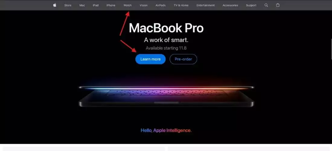
Apple’s homepage, on the other hand, is designed with simplicity in mind. It features a single primary button—the ‘Learn More’ button—that instantly draws your eye, followed by the ‘Pre-Order’ button. This clear layout makes it easier for users to navigate and, within just 8 seconds, understand exactly what Apple sells. Apple’s streamlined navigation bar also further reinforces their understanding of Hick’s law.

2. Leverage the Rule of Thirds
A classic rule in visual design, which you may have heard of before if you’re into photography, is the Rule of Thirds which suggests placing key elements within specific grid areas to draw attention and improve the overall user experience. By aligning essential content or CTAs along the grid lines, you create a balanced, visually appealing composition.
Adidas’s homepage uses the rule of thirds effectively. The main focal point is the person’s face, aligned along the bottom line. In the upper-left corner, the Adidas logo stands out. At the same time, the centre-top box focuses on navigation and displays promotions, positioned strategically since most users will use navigation at some point. The upper-right box is dedicated solely to shopping, allowing the user to very quickly understand where their basket is and other shop-related items. Cleverly, Adidas has placed each person in their box in the middle row, with the main CTA positioned in a separate box in the bottom left-hand corner.

3. Optimise Your Website for Speed
Fast load times are critical. Nearly half of users expect a website to load within two seconds, and many will abandon a site, increasing your “bounce rate”, if it takes over three seconds for a page to load. When was the last time you waited over 3 seconds for a website to load? Optimising images, using a CDN and leveraging other tools such as Website Speed Checkers can help significantly improve your load times, ensuring that visitors stay engaged. This step is particularly crucial for mobile users, where loading speed has the greatest impact on conversion rates.
Here are 5 free tools to check your website’s page speed:
We advise that you use the above tools as a guide instead of a checklist, as sometimes the information generated may be inaccurate or provide suggestions on things that you may have done/chose not to do intentionally.
4. Use Negative Space to Your Advantage
Negative space, or whitespace, is a key web design principle to boost your conversion rate. Giving elements room to breathe makes your website feel organised and easy on the eyes. This enhances readability and helps users process information without feeling overwhelmed. Effective use of whitespace can make your website more scannable, which improves user retention and conversions.
Let’s take another look at Apple’s homepage, which they updated while I was writing this blog. Apple uses ample whitespace to draw attention directly to the product they’re promoting—currently, the iPhone 16 Pro. This clean, minimalist approach ensures that the product remains the user’s primary focal point.

5. Consider the F-Layout in Your Web Design
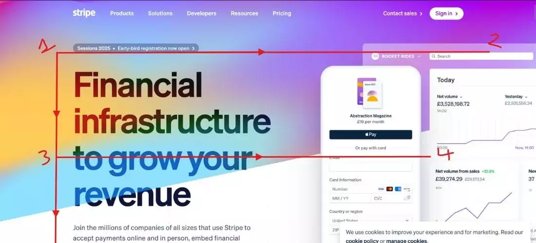
The F-shaped reading pattern reflects how most users scan a website—left to right and top to bottom. Placing key information and CTAs along this path ensures they’re noticed. Structure your layout with this pattern in mind to highlight essential elements at the top left, where users’ attention naturally starts.

6. Use Colours Meaningfully
Colours evoke emotions and can significantly impact user decisions. Choose a colour palette that aligns with your brand’s voice and objectives. High-contrast colours for buttons and important text draw attention where it matters. Aim for a cohesive colour scheme with limited colours to maintain simplicity and a pleasing visual experience.
7. Remember to K.I.S.S. (Keep It Simple, Stupid)
Simplicity lies at the core of our web design principles, focusing on eliminating clutter, unnecessary elements, and overly complex features. Every design choice is intentional, ensuring a streamlined and intuitive user experience. A clean, straightforward design is far more effective in converting visitors than one overwhelmed by excessive options and visuals.
8. Apply the 8-Second Rule
With an average human attention span of just 8 seconds, you have a small window to make an impression. Use concise, benefit-driven headlines and bold visuals to capture interest quickly. Strong, focused CTAs and engaging multimedia elements can help you grab attention immediately, boosting your chances of conversion.
9. Remember the Gestalt Similarity Principle
The Gestalt web design principle emphasizes that grouping items enables users to visually associate similar elements, enhancing their ability to process information more efficiently. By grouping related content or actions, such as testimonials near a CTA, you reduce friction and enhance the flow of your website. This approach makes it easier for visitors to absorb information and act on it.
10. Use Faces to Build Familiarity
Adding human faces to your website—whether in testimonials, case studies, or even blog posts—creates an emotional connection with visitors. Seeing relatable faces builds trust and familiarity, making users feel more connected to your brand. For personal brands, professional photos can enhance this connection further.
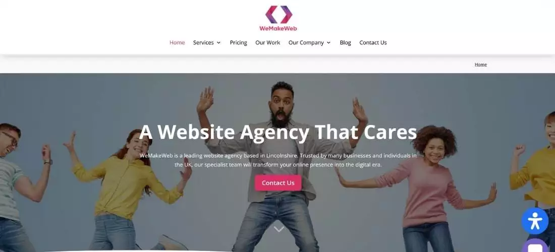
For example, on our website, we use faces to engage our users and build trust. By adding faces to our testimonials and other various pages on the website, we create a personal connection that adds credibility, leading to higher conversions.

11. Use High-Quality Images
First impressions count, and high-quality images set the tone for your site’s credibility. Avoid pixelated or irrelevant images that can detract from your message. Instead, choose professional visuals that align with your brand and resonate with your audience. High-quality imagery can create a polished, reliable impression that encourages engagement. Make sure to compress images before you add them to your website to keep your pages loading speed fast.
Follow these Good Web Design Principles and Turn Your Website Into a Conversion Powerhouse
Applying these 11 great web design principles can dramatically improve your website’s performance. From enhancing user navigation with visual hierarchy to optimising page speed, each step contributes to a smoother, more engaging user experience. Prioritise simplicity, clarity, and a user-centred approach to make your website a conversion powerhouse.
If you’re looking to optimise your web design and maximise conversions, our Lincolnshire web design services offer the expertise you need. Let’s turn your website into a growth-driven asset that leaves a lasting impression on your audience!

0 Comments